
Have you ever wondered what font ChatGPT uses when you interact with its clean and modern interface? Typography may look like a small design detail, but it plays a major role in readability, user experience, and overall interface quality.
Every response you read in ChatGPT is designed with a focus on clarity and comfort. The font system is carefully chosen to ensure that text remains easy to read across different devices, screen sizes, and platforms.
So, when we ask “what font does ChatGPT use?”, we are actually exploring how OpenAI improves usability and design through typography. In this article, we will break down the ChatGPT font system, its design choices, and why it matters for modern digital experiences.
What Font Does ChatGPT Use on Its Website and App?

The ChatGPT interface uses a carefully designed typography system rather than a single simple font. The primary font widely associated with ChatGPT’s UI is a modern geometric sans-serif typeface known as Söhne, which is designed for clean digital readability.
This font choice helps ChatGPT maintain a professional and minimal interface that feels modern and distraction-free. The goal is not to draw attention to typography, but to make reading as smooth as possible.
However, ChatGPT does not rely only on one font. Instead, it uses a smart font stack system. This means if the primary font fails to load, the system automatically switches to fallback fonts such as:
- San Francisco (on Apple devices)
- Segoe UI (on Windows devices)
- System default sans-serif fonts
This ensures that the user experience remains consistent across all devices and browsers.
Additionally, when ChatGPT displays code, it switches to monospace fonts. This helps differentiate programming content from normal text and improves clarity for developers and technical users.
Which Font Family Powers the ChatGPT User Interface?
ChatGPT uses a layered typography system that includes different font roles depending on the content type. This is a common practice in modern UI/UX design.
Primary UI Font
The main interface text uses a clean sans-serif typeface designed for readability and long-form reading. This ensures that long AI responses remain comfortable to read.
UI Elements and Buttons
Buttons, menus, and labels use the same font family but with different weights and sizes. This maintains visual consistency across the entire platform.
Code and Technical Output
For programming code, ChatGPT switches to monospace fonts. This is essential because each character has equal spacing, making code easier to read and debug.
System Fallback Fonts
If the primary font is not available, system fonts take over automatically. This ensures that ChatGPT always remains readable regardless of device or browser limitations.
This structured approach shows that ChatGPT’s typography system is not random—it is carefully engineered for performance, clarity, and accessibility.
Why Did OpenAI Choose This Font for ChatGPT?
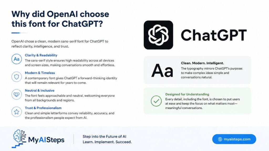
Typography in AI tools is not just about aesthetics—it directly affects usability and trust. OpenAI’s font choice reflects several important design goals.
Readability First Approach
The main reason behind ChatGPT’s font selection is readability. Since users spend long periods reading AI-generated responses, the font must reduce eye strain and maintain clarity.
Clean and Minimal Design
A geometric sans-serif font helps create a distraction-free environment. This allows users to focus on the content rather than visual noise.
Trust and Professional Feel
Typography also affects perception. A clean, modern font makes the platform feel more reliable and professional, which is critical for AI systems.
Cross-Device Consistency
ChatGPT is used on mobile, desktop, and tablets. The font system ensures that text looks consistent across all screen sizes and operating systems.
Accessibility Considerations
Good typography improves accessibility for users with reading difficulties. Clear letter shapes and balanced spacing make the interface easier for everyone to use.
Overall, the font choice is not random—it is a strategic decision that supports user experience, branding, and performance.
Is ChatGPT Using a Custom Font or a Standard Font?
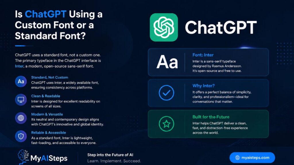
ChatGPT uses a combination of custom design principles and system-supported fonts. While Söhne is often associated with its typography, the system is not limited to a single static font file.
Instead, ChatGPT uses a font strategy that blends:
- Custom or licensed typefaces for branding
- System fonts for fallback reliability
- Monospace fonts for code readability
This hybrid approach ensures performance and stability across all environments.
A fully custom font would offer strong branding, but it could also create loading issues. By combining system fonts and optimized typography rules, OpenAI achieves both design quality and technical reliability.
How the ChatGPT Font Improves Readability and User Experience
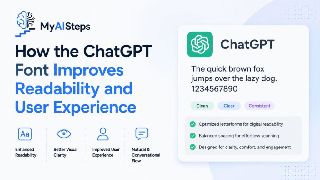
Typography directly affects how users interact with AI-generated content. ChatGPT’s font system improves UX in several ways:
Reduced Eye Strain
Long conversations with AI can be tiring. A well-spaced sans-serif font reduces visual fatigue and makes reading easier.
Better Content Flow
Proper line height and spacing help users follow long responses without losing focus.
Clear Information Hierarchy
Different font weights create a visual structure, helping users distinguish between headings, body text, and code.
Mobile Optimization
The font scales smoothly on small screens, ensuring readability even on mobile devices.
These factors together create a smooth reading experience, which is essential for AI platforms.
What Is the Difference Between ChatGPT’s Font and Other AI Platforms?
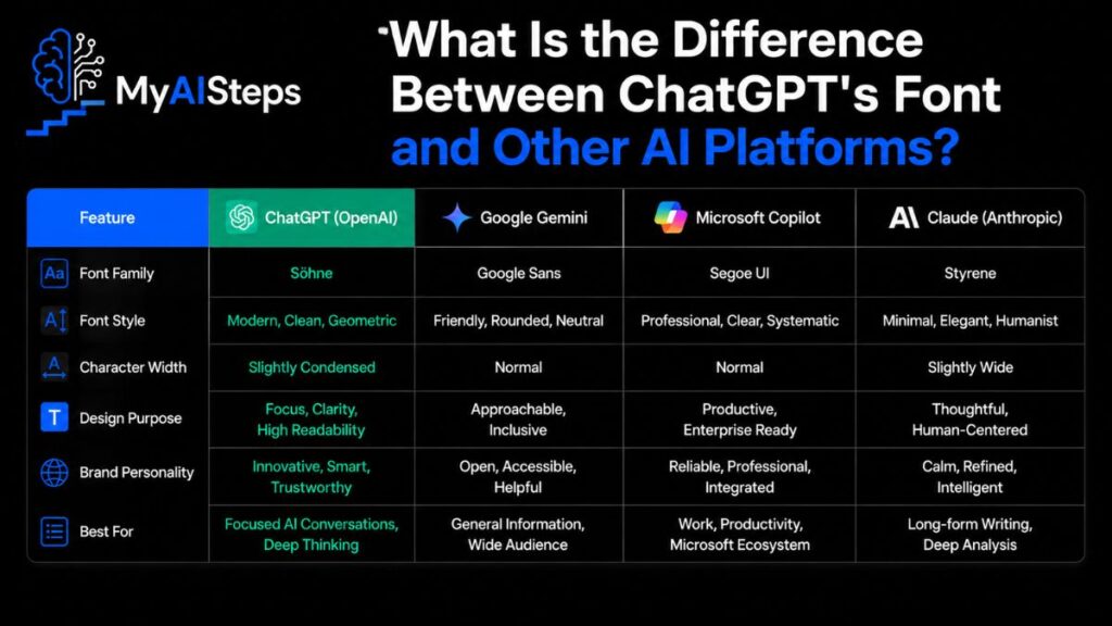
Different AI platforms use different typography strategies based on their design philosophy.
ChatGPT vs Google Gemini
Google Gemini uses Google’s system fonts like Roboto. These are widely used, open-source, and optimized for Google’s ecosystem.
ChatGPT vs Claude
Claude focuses on a minimal and neutral typography system, prioritizing simplicity over branding.
ChatGPT vs Microsoft Copilot
Copilot uses system fonts like Segoe UI, blending into Microsoft’s ecosystem rather than creating a unique identity.
Key Difference
ChatGPT stands out because of its stronger focus on refined typography and consistent UI design, making it feel more polished and premium.
Can You Use the Same Font Style as ChatGPT on Your Website?
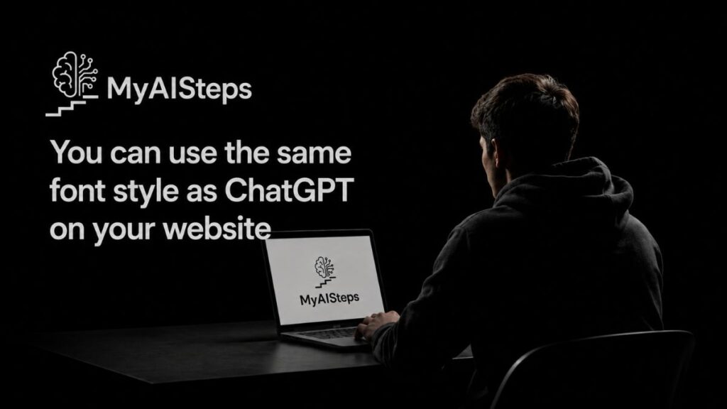
You cannot directly use proprietary fonts like Söhne without a proper license. However, you can achieve a similar visual style using open-source alternatives.
Popular alternatives include:
- Inter
- Roboto
- DM Sans
- Poppins
These fonts follow similar principles:
- Clean geometric shapes
- High readability
- Modern UI compatibility
Implementation Tip
A typical web font stack looks like this:
font-family: “Inter”, -apple-system, BlinkMacSystemFont, “Segoe UI”, sans-serif;
This ensures consistency across browsers and devices.
The key is not copying ChatGPT’s font, but replicating its design principles.
Best Alternatives to the ChatGPT Font for Designers and Bloggers
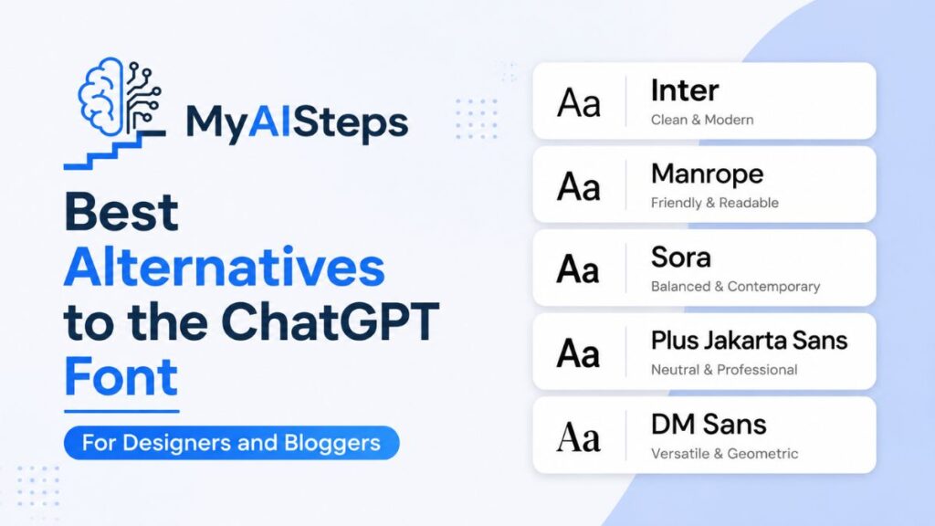
If you want similar typography without licensing costs, several free fonts can achieve a comparable aesthetic.
Inter
Inter is one of the best alternatives for UI design. It is highly optimized for screens and widely used in modern web apps.
Roboto
Roboto is Google’s default font and offers excellent readability and global compatibility.
DM Sans
DM Sans is clean, modern, and perfect for SaaS and AI-related interfaces.
Poppins
Poppins provides a friendly geometric style suitable for creative projects.
Lato
Lato is balanced and works well for blogs and long-form content.
All these fonts are free and available on Google Fonts.
How to Identify Fonts Used by Websites Like ChatGPT
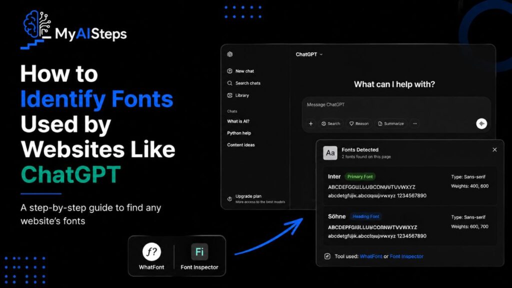
You can identify fonts using simple tools:
Browser Inspect Tool
Right-click → Inspect → Computed → font-family
Font Detection Extensions
Tools like WhatFont or Font Ninja help identify fonts instantly.
View Page Source
Developers can check CSS files for font declarations.
These methods help designers understand typography choices in modern UI systems.
Final Thoughts
Typography is more than just visual design—it directly affects how users experience digital products. ChatGPT’s font system demonstrates how thoughtful typography improves readability, trust, and usability.
Instead of relying on trendy fonts, OpenAI focuses on clarity, accessibility, and performance. This is why the interface feels so smooth and easy to use.
For designers, bloggers, and developers, the main lesson is simple: good typography should disappear. It should not distract the user, but instead help them focus on the content.
Whether you are building a website, blog, or AI tool, choosing the right font is not a small decision—it is a core part of user experience design.
Ultimately, ChatGPT’s typography shows that when design is done right, users don’t notice the font—they only understand the message.
Frequently Asked Questions
What font does ChatGPT use?
ChatGPT uses a modern sans-serif typography system, commonly associated with Söhne, along with system fallback fonts.
Is the ChatGPT font free?
No, Söhne is a commercial font and requires licensing.
Can I use a similar font on my website?
Yes, you can use free alternatives like Inter or Roboto to achieve a similar look.
Which font looks closest to ChatGPT’s font?
Inter is considered the closest free alternative in terms of design and readability.