
This guide explains what a ChatGPT Logo Transparent PNG is, why a transparent background is useful, and when to use this file format in blogs, presentations, websites, social media graphics, tutorials, and other digital projects. You’ll also learn where to find official logo assets and how to use them responsibly while following brand guidelines.
In addition, we’ll compare PNG with SVG, WebP, JPEG, and other common image formats, explaining the strengths and limitations of each so you can choose the best option for your specific design needs.
By the end of this guide, you’ll understand how to identify a high-quality transparent logo, download it from trusted sources, place it on different backgrounds without losing quality, and avoid common mistakes that can lead to poor visuals or brand-use issues.
What Is a ChatGPT Logo Transparent PNG?
A ChatGPT Logo Transparent PNG is a logo image saved in PNG format with the background removed. Instead of sitting on a white, black, or colored square, the logo appears with a transparent canvas around it. This allows the mark to blend naturally into different designs, such as website headers, blog banners, thumbnail graphics, presentation slides, infographics, and product comparison visuals.
The key benefit of a transparent PNG is flexibility. For example, if you are designing a blog featured image with a soft gradient background, a regular JPG logo with a white background may look pasted on. A transparent PNG removes that problem because only the logo itself appears on the design. The surrounding area remains invisible, which gives the final graphic a cleaner and more professional look.
PNG is especially popular because it supports transparency while keeping edges sharp. This matters for logos because a logo often includes curves, lines, and small details that can look rough if the file is compressed too much. Unlike JPG, which does not support true transparency, PNG can preserve a clean cutout effect around the logo. That is why designers often prefer PNG files when placing logos over custom backgrounds.
However, a transparent PNG is not always the best file for every use case. If you need a logo for a website, app interface, or scalable design system, SVG may be better because it can scale without losing sharpness. If you need a fast-loading web image, WebP may be useful. If you need print-quality artwork, vector-based formats are usually safer than small raster images.
Here is a simple comparison:
| File Format | Best For | Transparency Support | Main Advantage | Limitation |
| PNG | Blog graphics, thumbnails, presentations | Yes | Clean background removal and sharp edges | File size can be larger |
| SVG | Websites, icons, responsive layouts | Yes | Scales perfectly without blur | Not always accepted by every platform |
| WebP | Fast-loading web pages | Yes | Smaller file size than PNG in many cases | Some workflows still prefer PNG |
| JPG | Photos and general images | No true transparency | Small and widely supported | Not ideal for logos with no background |
| PDF/EPS | Print and professional design | Usually yes | High-quality output for print | Requires design software |
A transparent PNG works best when you need quick placement and broad compatibility. For instance, a content writer may use it in a “how-to” guide image, a blogger may place it in a comparison graphic, and a presentation designer may add it beside other platform logos. In each case, the transparent background keeps the design clean and avoids visual clutter.
The main thing to remember is that transparency does not automatically mean the file is official, high-resolution, or safe to use. A file may look clean but still be unofficial, modified, or copied from an unreliable source. That is why checking the source and respecting brand guidelines is just as important as choosing the right file format.
Why Do People Search for a ChatGPT Logo with No Background?
People usually search for a ChatGPT logo with no background because they want a clean, ready-to-use visual asset. A background-free logo is easier to add to content without extra editing. It saves time, improves design quality, and helps the logo sit naturally inside different visual layouts.
One common reason is blog and tutorial design. A writer creating an article about ChatGPT may want to add the logo to a featured image, section graphic, or comparison table. If the logo has a white background, it may clash with the website’s design. A transparent PNG solves that by allowing the mark to appear directly on the chosen background.
Another reason is social media content. Creators often design square posts, carousel slides, video thumbnails, and short-form visual explainers. These formats usually use bold colors, gradients, screenshots, or layered elements. A transparent PNG is useful because it can be placed over those designs without needing manual background removal.
Businesses and educators may also need a no-background logo for slides, reports, internal training material, or platform comparison documents. For example, a trainer explaining several digital platforms in one slide may place multiple logos side by side. Transparent logos make the layout feel consistent because every mark appears without an unwanted box or border.
Clean Design Placement
The biggest practical benefit is clean placement. A transparent logo can sit on a dark background, light background, colored card, website mockup, or image banner. This makes it easier to create a design that feels intentional instead of patched together.
For example, imagine a website section with a navy background. A logo file with a white box around it would immediately look unprofessional. A transparent PNG avoids that issue and keeps the layout visually smooth.
Faster Workflow for Writers and Designers
Many people who search for a ChatGPT Logo Transparent PNG are not full-time designers. They may be bloggers, marketers, students, teachers, business owners, or content managers who need a quick asset for a project. A ready-made PNG saves time because they do not have to remove the background manually.
This is especially helpful when creating multiple graphics. If you are preparing a blog post, Pinterest pin, YouTube thumbnail, and LinkedIn carousel from the same topic, using a transparent file helps keep branding elements consistent across every format.
Better Visual Consistency
Transparent logos also help maintain design consistency. When all logos in a comparison graphic have clean backgrounds, the final image looks balanced. This matters in articles that compare features, pricing, use cases, or alternatives. Poor-quality logo files can make even a well-written article feel less credible.
Still, convenience should not replace caution. The official design guidelines state that OpenAI’s name, logo, and ChatGPT-related brands are OpenAI trademarks, and third parties should follow the published guidance when using them.
Where Can You Find the Official ChatGPT Transparent Logo?
The safest place to find official logo assets is the official OpenAI design guidelines page. The page provides brand guidance, logo usage rules, and a download option for official logo files. It also explains how the logo should and should not be used.
This is important because search results often include third-party PNG websites, image libraries, icon directories, and copied files. Some of those files may be outdated, modified, poorly exported, or incorrectly labeled. A logo downloaded from an unofficial source may appear fine at first, but it can create problems when used in professional content, especially if it is low-resolution or visually altered.
The official guidance says the logo should be used only when it directly relates to OpenAI services, should follow the style guides and usage terms, and should be used exactly as provided with proper acknowledgment. It also warns against implying endorsement, confusing users about sponsorship, using the logo more prominently than your own brand, placing it on merchandise, or modifying it.
Check the Source Before Downloading
Before downloading any transparent PNG, check where it comes from. An official brand page is safer than a random image result. If you use a third-party file, compare it with the official version and make sure it has not been stretched, recolored, cropped, or redesigned.
A good transparent logo file should have:
- Clean edges with no rough white outline
- Enough resolution for your design size
- Correct proportions
- No added shadows, gradients, borders, or effects
- No unrelated text or decorative elements
- A transparent canvas, not a fake checkerboard background
A fake checkerboard background is a common issue. Some images show a gray-and-white checkerboard pattern, but the pattern is part of the image itself. That means the file is not truly transparent. A real transparent PNG will show the background of your design behind the logo when placed into editing software.
Use the Logo in the Right Context
Safe usage depends not only on where you download the file but also on how you use it. If you are writing an informational article, creating a tutorial, or explaining a related feature, using the logo as a reference may be appropriate when done carefully. But the logo should not make readers think your website, product, app, or service is officially endorsed.
For example, placing the logo inside a blog image titled “How to Use ChatGPT for Research” is different from placing it in your own app icon or business logo. The first use is contextual. The second may create brand confusion.
A safer design approach is to keep your own brand identity more prominent. Use the logo as a supporting visual, not as the main identity of the page, product, or campaign. Give it enough spacing, avoid changing its shape or colors, and do not combine it with your own logo in a way that suggests partnership unless you have approval.
Choose the Right File Format for Your Project
If the official download provides multiple formats, choose based on your use case. Use PNG when you need a simple transparent image for blog graphics, slides, and thumbnails. Use SVG when you need sharp scaling on websites or responsive layouts. Use vector or print-ready formats when preparing professional print material.
For SEO content, PNG is usually enough for featured images and in-article graphics, but file size still matters. Compress the image carefully before uploading it to your website. A heavy image can slow page speed, while an over-compressed image can make the logo look blurry. The best balance is a clean transparent PNG with reasonable dimensions and optimized file size.
Also, name the file properly before uploading it. A descriptive filename such as chatgpt-logo-transparent-png.png is clearer than a random file name like image-123.png. Add helpful alt text that describes the image naturally, such as “ChatGPT logo transparent PNG used in a design example.” This improves accessibility and gives search engines better image context without keyword stuffing.
In short, the best way to use a transparent logo is to combine three things: an official or verified source, the correct file format, and responsible placement. When those three points are handled properly, the logo can improve your design without creating quality, clarity, or brand-use problems.
How to Download a High-Quality ChatGPT Logo PNG Safely
Downloading a logo may seem simple, but the source matters more than most people realize. A clean-looking image from a random website can still be low-resolution, outdated, edited, or incorrectly exported. When you need a ChatGPT Logo Transparent PNG for a blog post, presentation, tutorial image, comparison graphic, or educational visual, the safest first step is to look for official brand assets or official usage guidance rather than grabbing the first image result.
A high-quality transparent PNG should have sharp edges, balanced spacing, correct proportions, and a truly transparent background. It should not have a white square, gray checkerboard pattern, blurry outline, stretched shape, or added effects. Many unofficial PNG files online look transparent in preview mode, but once placed on a dark or colored background, they reveal rough edges or a hidden background layer. That small quality issue can make an otherwise professional design look unfinished.
The official brand guidelines explain that the logo should be used only when it directly relates to OpenAI services, should be used as provided, and should not be modified in a way that creates confusion or suggests endorsement. This matters because logo usage is not only a design issue; it is also a trust issue. Readers should be able to understand that your content is informational, not an official page, partnership, or sponsored brand asset unless that relationship actually exists.
Before downloading or using any logo file, check these points carefully:
- Source quality: Prefer official brand pages or verified brand resources over random PNG download websites.
- Image clarity: Zoom in and check whether the edges remain clean.
- True transparency: Place the logo over a colored background to confirm there is no hidden white box.
- Correct proportions: Avoid files that look stretched, squeezed, tilted, or redesigned.
- No extra effects: Do not use versions with shadows, glow effects, outlines, gradients, or decorative backgrounds unless official guidance allows them.
- Suitable resolution: Choose a file large enough for your design, but not so large that it slows down your page.
- Responsible context: Use the logo only where it helps explain the topic and does not mislead users.
For example, if you are creating a blog image about how to recognize official platform features, a transparent logo may help readers understand the topic quickly. But if you place the logo beside your own product name in a way that looks like a joint brand identity, users may assume there is an official relationship. That is where safe usage becomes important.
It is also smart to rename the file before uploading it to your website. Instead of using a file name like download-1.png, choose something descriptive such as chatgpt-logo-transparent-png.png. This helps organize your media library and gives search engines clearer image context. For accessibility, write natural alt text that explains the image without stuffing keywords. A good example would be: “Transparent ChatGPT logo used as a visual reference in a design guide.”
Finally, compress the image carefully. Transparent PNG files can sometimes be heavier than expected, especially if they are exported at large dimensions. A heavy logo file may slow down a page, while an over-compressed one may look blurry. The goal is to keep the file clean, lightweight, and visually accurate.
ChatGPT Logo PNG vs SVG: Which File Format Should You Use?
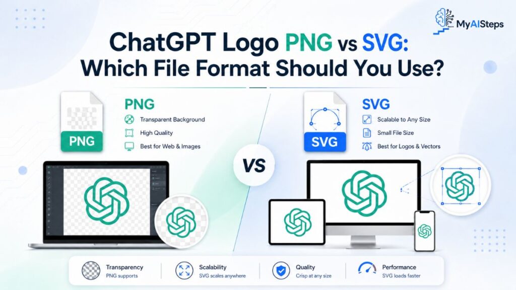
PNG and SVG are both useful, but they serve different design needs. A PNG is a raster image, which means it is made of pixels. An SVG is a vector file, which means it is built from scalable paths. In simple terms, PNG is convenient and easy to use, while SVG is more flexible for professional web and interface design.
A PNG file is often the best choice for blog images, thumbnails, social media graphics, and presentation slides. Most platforms accept PNG files, and transparent PNGs are easy to place inside design editors. If you are preparing a featured image, comparison graphic, or tutorial screenshot, PNG is usually quick and practical.
SVG is better when the logo needs to stay perfectly sharp at different sizes. For example, if a website header displays the same logo on desktop, tablet, and mobile screens, SVG can scale smoothly without becoming pixelated. A small PNG may look fine at one size but blurry when enlarged. SVG avoids that issue because it does not rely on fixed pixels.
Here is a simple comparison to help choose the right format:
| Feature | PNG | SVG |
| Best use case | Blog graphics, thumbnails, slides, social posts | Websites, app interfaces, responsive layouts |
| Transparency | Supported | Supported |
| Scalability | Can blur when enlarged | Scales cleanly at any size |
| Ease of use | Very easy for beginners | Better for web/design workflows |
| File size | Can be larger depending on dimensions | Often lightweight for simple logos |
| Editing flexibility | Limited once exported | Easier to resize and adapt without quality loss |
| Platform support | Widely accepted | Widely supported online, but not accepted everywhere |
If you are a content writer or blogger, PNG will usually be enough for everyday publishing needs. You can place it in Canva, Photoshop, WordPress, Google Slides, PowerPoint, or most social design platforms without extra setup. That is why many people specifically search for a ChatGPT Logo Transparent PNG instead of a vector file.
However, if you are working with a developer, designing a landing page, or building a responsive interface, SVG may be the better option. It keeps the logo sharp on high-resolution screens and adapts more cleanly across layouts. SVG also avoids the problem of uploading multiple logo sizes for different screen widths.
A practical way to decide is this: use PNG for quick content graphics and use SVG for scalable website placement. If the logo will be part of a static blog image, PNG is simple and effective. If it will appear as a live web element that needs to resize smoothly, SVG is usually the stronger choice.
The only caution with SVG is that it should come from a trusted source. Since SVG files contain code-based markup, website owners should avoid uploading unknown SVG files without proper security handling. For most non-technical users, a verified PNG is the safer and easier option.
Best Ways to Use the ChatGPT Transparent Logo in Your Designs
A transparent logo works best when it supports the message instead of dominating the design. The goal is not to make the entire graphic look like an official brand asset. The goal is to use the logo as a visual reference that helps readers immediately understand the topic.
One of the best uses is in blog featured images. For example, if your article explains file formats, download safety, or logo usage guidelines, a transparent logo can be placed beside a laptop mockup, design workspace, or simple abstract background. This gives readers a quick visual connection without cluttering the image.
Another good use is inside tutorial graphics. If you are explaining where to find brand assets, how to compare file formats, or how to use transparent images in design software, a small logo can act as a visual cue. It should not cover the main instructional content, and it should not be used as a decorative element without purpose.
Transparent logos also work well in comparison visuals. For instance, if you are comparing PNG, SVG, WebP, and JPG formats, placing the logo on different backgrounds can show how transparency affects design quality. A white-box logo on a dark background may look awkward, while a true transparent PNG blends naturally into the layout. This kind of example helps readers understand the value of the correct file format.
For social media graphics, keep the logo placement simple. Use enough white space, avoid heavy filters, and do not place the logo over a busy area of the image. A transparent logo should remain readable and clean. If the background is too complex, add a subtle neutral shape behind the logo rather than adding effects directly to the mark.
When using the logo in designs, these practices help maintain a professional look:
- Keep the logo at a reasonable size.
- Leave enough spacing around it.
- Avoid stretching or rotating it.
- Do not recolor it unless official guidance allows that version.
- Do not combine it with your own logo in a way that suggests partnership.
- Use it only when it adds context to the content.
- Make sure your own website or brand identity remains clearly separate.
For example, a blog banner titled “PNG vs SVG File Formats” can use the logo as one small visual example among other format icons. That feels educational and relevant. But using the logo as the main badge on your homepage, sales page, or product packaging could create confusion. Readers may assume your brand is officially connected to the trademark owner.
The official brand guidance also warns against using the logo more prominently than your own brand or using it in ways that imply sponsorship or endorsement. This is especially important for commercial websites, affiliate content, digital products, templates, and downloadable resources.
A clean design should feel clear, balanced, and honest. Use the logo to support the topic, not to borrow authority. That single principle helps avoid most design and trust-related problems.
Common Issues When Using a ChatGPT Logo Without Background
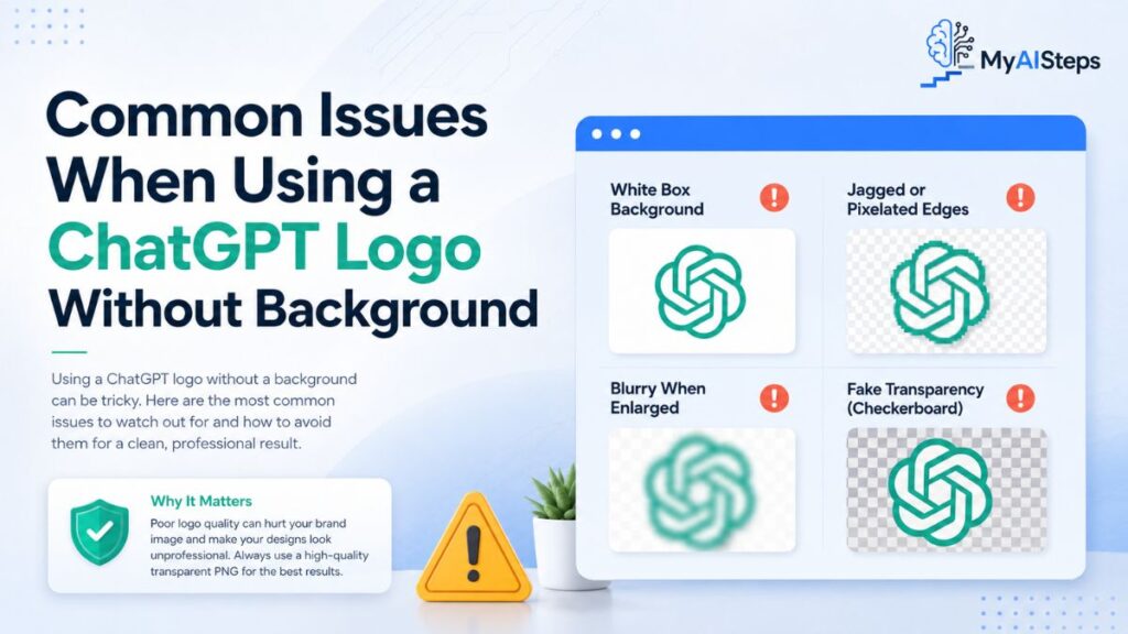
Even when the file looks fine at first, several issues can appear once you place it inside a real design. The most common problem is fake transparency. Many images online show a checkerboard pattern behind the logo, but the checkerboard is actually part of the image. When placed into a design, it does not disappear. This usually happens when someone downloads a preview image instead of the actual transparent PNG.
Another common issue is poor edge quality. A logo may look acceptable on a white background but show jagged edges, gray outlines, or leftover pixels on darker backgrounds. This usually means the background was removed poorly or the file was exported at low quality. For professional content, always test the logo on both light and dark backgrounds before publishing.
Blurriness is another problem. A small PNG may look sharp in preview mode but lose quality when enlarged for a featured image or presentation slide. Since PNG files are pixel-based, they cannot scale endlessly. If you need a larger design, start with a higher-resolution file or use a vector format when available.
Some users also run into color and contrast issues. A logo that looks clear on a white background may disappear on a light gray or gradient background. The opposite can happen on dark layouts. The solution is not to add random effects to the logo, but to choose a better background, adjust spacing, or use an officially provided version suited to that layout.
Incorrect usage is another important issue. A logo without background is easy to place anywhere, but that does not mean every placement is appropriate. Using it as a website favicon, app icon, product logo, course badge, or template cover can create brand confusion if the design suggests official ownership or endorsement. According to OpenAI’s terms, use of its name and logo must follow its Brand Guidelines.
File size can also become a technical issue. Transparent PNGs are often heavier than JPGs, especially when exported at large dimensions. A large file can slow page loading, which may affect user experience and SEO performance. Before uploading, resize the image to the actual display dimensions and compress it without damaging sharpness.
Another small but common mistake is weak image naming. Website owners sometimes upload files with generic names like logo-final-new.png or transparent-image.png. A better filename helps with organization and image SEO. Use clear, natural names that describe the file, but do not repeat the focus keyword unnaturally.
Here are common problems and quick fixes:
- White box around the logo: Use a true transparent PNG instead of JPG.
- Checkerboard background appears: Download the actual transparent file, not the preview image.
- Logo looks blurry: Use a larger PNG or a vector format.
- Edges look rough: Find a cleaner file from an official or verified source.
- Logo disappears on the background: Improve contrast or use a more suitable layout.
- File is too heavy: Resize and compress it before uploading.
- Design looks misleading: Reduce logo prominence and keep your own branding separate.
- Alt text looks spammy: Write natural, descriptive alt text instead of repeating the keyword.
A transparent logo should make your design cleaner, not create new quality or trust problems. Before publishing, place the image inside the actual design, view it at full size, check mobile display, and confirm that the final result looks clear and contextually appropriate. This simple review can prevent most issues before the content goes live.
Is It Legal to Use the ChatGPT Logo on a Website or Social Media?
Using the ChatGPT logo on a website, blog, social media post, thumbnail, or presentation depends on context. In simple terms, you should not treat the logo as a free design element that can be used anywhere without limits. It is connected to a protected brand identity, which means the safest use is informational, editorial, or referential rather than promotional in a way that suggests ownership, partnership, sponsorship, or endorsement.
For example, if you are writing a guide about downloading a ChatGPT Logo Transparent PNG, using the logo as a small visual reference inside the article may be reasonable when it directly supports the topic. But using the same logo as your website’s main identity, app icon, product badge, course logo, or business branding can mislead visitors. They may think your project is officially connected to the original brand owner, even if that was not your intention.
OpenAI’s Terms of Use state that its name and logo may only be used according to its Brand Guidelines. The official Design Guidelines also say the logo should be used only when it directly relates to OpenAI services, should be used exactly as provided, and should not be used in a way that implies endorsement or partnership.
This is especially important for commercial websites and social media pages. A blog post, tutorial, review, or comparison article is different from a paid product page, downloadable template, digital course cover, or advertising banner. The more your design looks like official branding, the higher the risk of confusing users.
A safe real-world example would be a blog graphic that says, “How to Use Transparent PNG Files in Web Design,” where the logo appears as one small example among several file-format visuals. A risky example would be a landing page that places the logo beside your brand name with wording like “official solution,” “certified partner,” or “powered by” when no such relationship exists.
Social media needs the same care. If you use the logo in a carousel, reel cover, educational post, or tutorial thumbnail, keep it clearly connected to the topic. Do not make it appear as though the account is official. Avoid using the logo as your profile picture, page icon, permanent brand mark, or repeated visual identity unless you have clear permission.
A practical rule is this: if the logo helps explain the content, it may fit the context. If the logo makes your content look officially owned, approved, or endorsed, it is safer to avoid that use or seek permission. This is not legal advice, but it is a sensible approach for bloggers, designers, marketers, educators, and business owners who want to avoid brand confusion.
Important Branding Rules Before Using the ChatGPT or OpenAI Logo
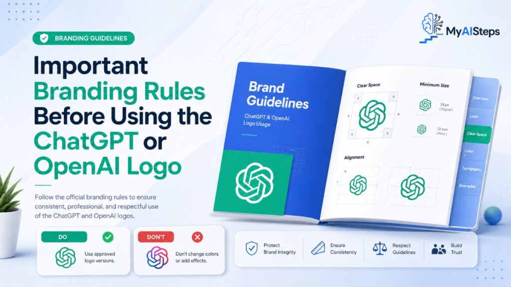
Before using the ChatGPT or OpenAI logo, you need to understand that brand assets are not just decorative graphics. They represent trust, ownership, recognition, and public identity. That is why official logo files usually come with usage rules. These rules help prevent misleading designs, poor-quality reproductions, and confusing brand associations.
The first rule is to use the logo only in a relevant context. If your article, video, guide, comparison page, or presentation directly discusses the service, the logo may help readers understand the topic faster. But if the logo is used only to attract attention or borrow credibility, the design becomes questionable. A logo should support the message, not carry the entire trust of the page.
The second rule is to avoid modification. Do not stretch, rotate, recolor, outline, distort, crop, animate, or rebuild the logo. Do not add shadows, gradients, 3D effects, glow effects, or decorative borders unless the official guidelines provide that version. A transparent PNG should remain clean and accurate. If the original mark is changed too much, it may no longer represent the brand correctly.
The third rule is to keep your own branding separate. Your website name, business name, app name, or project title should be more prominent than the third-party logo. If both appear together, there should be enough spacing and layout separation so users do not assume a partnership. OpenAI’s design guidance specifically warns against using its logo more prominently than your own brand or implying endorsement.
The fourth rule is to avoid merchandise and resale-style use. Do not place the logo on shirts, mugs, stickers, digital products, templates, printable packs, or commercial graphics as the main selling point. Even if the file is transparent and high-quality, that does not make it free for product branding.
The fifth rule is to use the official file whenever possible. Random PNG websites may offer transparent versions, but those files can be inaccurate, outdated, poorly cropped, or visually altered. Official assets are more reliable because they preserve the correct shape, spacing, and proportions.
A beginner-friendly way to think about branding rules is to separate “reference use” from “identity use.” Reference use means the logo helps readers understand what your content is about. Identity use means the logo appears to represent your own brand, product, or business. Reference use is usually safer. Identity use is where problems often begin.
For example, a blog article titled “PNG vs SVG File Formats” can show the logo in a small design example. That is reference use. But naming a software product with similar branding, using the logo in the product header, and making it look official would be identity use. That can confuse users and should be avoided.
Responsible logo usage protects both sides. It helps readers understand your content clearly, and it helps you maintain a professional, trustworthy website without creating unnecessary branding risks.
Best ChatGPT Logo Alternatives for AI Blogs, Apps, and Business Projects

If you are not sure whether using the official logo is appropriate, the best solution is to create or use an alternative visual style. This is especially useful for blogs, apps, business websites, service pages, digital products, and social media campaigns that discuss related topics but are not officially connected to the brand.
A strong alternative can still communicate the topic without relying on protected branding. For example, instead of placing the official logo at the center of a blog featured image, you can use abstract technology shapes, chat bubble icons, gradient cards, interface-style illustrations, or neutral assistant-related symbols. These visuals can make the content look modern while keeping your design independent.
For blogs, custom illustrations usually work very well. A simple image showing a laptop screen, message bubbles, document icons, or a clean digital workspace can explain the topic without using any official mark. This is often better for long-term branding because your website develops its own visual identity instead of depending on someone else’s logo.
For apps or business projects, a custom logo is the safest choice. Your brand mark should be unique, memorable, and clearly separate from existing platform identities. Avoid using similar shapes, colors, names, or icon styles that could make users think your product is officially connected to another company.
For social media, you can use visual metaphors instead of brand logos. A clean chat bubble, glowing search bar, keyboard close-up, document workflow, or abstract network pattern can make a post look professional. These alternatives are flexible, reusable, and less risky than placing a protected logo in every graphic.
Here are some useful alternatives:
| Use Case | Better Alternative | Why It Works |
| Blog featured image | Custom chat bubble illustration | Explains the topic without brand confusion |
| App icon | Original symbol or lettermark | Builds your own identity |
| Social media post | Abstract digital background | Looks modern and reusable |
| Tutorial graphic | Screenshot-style layout with neutral icons | Keeps the focus on education |
| Business landing page | Custom brand logo with simple interface visuals | Avoids false endorsement |
| Presentation slide | Generic assistant or message icon | Clean and professional for explanation |
Another smart option is to use text-based design. A strong title, clean typography, and simple background can often perform better than a logo-heavy graphic. For example, a featured image with the text “Transparent PNG File Guide” and a minimal file icon may look more original than a layout built around a third-party mark.
You can also create a visual system for your website. Use consistent colors, rounded cards, icon styles, gradients, and spacing. Over time, readers will recognize your own design language. This is more valuable than repeatedly using official logos because it strengthens your brand instead of borrowing attention from another one.
If you still need a logo for direct reference, keep it small, accurate, and clearly contextual. But for most blogs, apps, and business projects, original visuals are the better long-term choice. They reduce brand risk, improve design consistency, and make your content look more independent.
Conclusion
A transparent logo file can make designs cleaner, more flexible, and easier to use across websites, blogs, presentations, and social media graphics.
The most important points are file quality, correct format selection, safe downloading, and responsible placement.
PNG is useful for quick visual work, while SVG is better for scalable web layouts.
Brand rules also matter because a logo should support the content without making users think your project is official or endorsed.
If you use a ChatGPT Logo Transparent PNG, choose a reliable source, keep the design accurate, and use it only where it fits the context.
For business, app, or long-term branding projects, custom visual alternatives are often safer and more professional.
A clean, honest design always works better than a confusing one.
FAQs
Can I use the ChatGPT logo on my blog?
Yes, you can use it for relevant informational context, but it should not imply official approval, partnership, or endorsement.
Where can I download the official ChatGPT logo?
The safest source is the official OpenAI brand or design guidelines page.
Is PNG better than SVG for a transparent logo?
PNG is easier for blog images and social graphics, while SVG is better for scalable website and interface use.
Why does my transparent logo show a checkerboard background?
That usually means you downloaded a preview image, not a real transparent PNG file.
Can I use the ChatGPT logo as my app icon?
No, using it as your own app icon can create brand confusion and should be avoided unless you have permission.
What is the best file name for image SEO?
Use a clear name like chatgpt-logo-transparent-png.png instead of a random file name.
What is the safest alternative to using the official logo?
Use custom icons, chat bubble graphics, abstract digital visuals, or your own original brand mark.